In previous post Using MetaData to Control Zoomdata Visualization we learnt how to control Visualization using info from Meta Data Service.
Process of creating a custom visualization is described in: How to build Zoomdata Visualizations
In this post, we will create reusable Web Component as shown below:
<zoomdata-visualization style="position: absolute; width: 600px; height: 500px;"
      key="KVKWiD8kUl"
      host="developer.zoomdata.com"
      secure="true"
      port="443"
      path="/zoomdata-2.6"
      source-name="My IMPALA Source"
      visualization="Bars"
    />
This is a custom HTML element, which can be reused by React, Angular or any other framework. It is the same HTML Element as <div> or <h3>.
These custom HTML elements accept several kinds of attributes and contain the details about connecting to the backend of Zoomdata. They also control which visualization to render and when to do it.
GitHub repository with example is located here: gladimdim/zd-webcomponent. Or you can follow steps below.
Create zoomdata-visualization custom HTML Element
First, we need to create
A good starting point for creating custom web components using latest ES2015 Modules can be found here: https://www.polymer-project.org/blog/2017-08-22-npm-modules.
Create following file zoomdata-visualization.js:
import { Element as PolymerElement } from '../node_modules/@polymer/polymer/polymer-element.js';
import * as sdk from '../node_modules/zoomdata-client/distribute/sdk/zoomdata-client.js';

export class ZoomdataVisualization extends PolymerElement {
  static get template() {
    return `
        <div class="wrapper">
            <div id="visContainer" class="vis-content" style="width: 100%; height: 100%"/>
        </div>
        `;
  }
  connectedCallback() {
    super.connectedCallback();
    initApp(this);
  }
  static get properties() {
    return {
      path: {
        type: String,
        reflectToAttribute: true,
      },
      host: {
        type: String,
        reflectToAttribute: true,
      },
      port: {
        type: Number,
        reflectToAttribute: true,
      },
      key: {
        type: String,
        reflectToAttribute: true,
      },
      secure: {
        type: Boolean,
        reflectToAttribute: true,
      },
      sourceName: {
        type: String,
        reflectToAttribute: true,
      },
      visualization: {
        type: String,
        reflectToAttribute: true,
      },
      layout: {
        type: String,
        value: 'control-top',
      },
    };
  }
}

customElements.define('zoomdata-visualization', ZoomdataVisualization);
Here we extend PolymerElement and provide template and properties static methods. Template method returns a string which is converted to HTML. Properties method returns map of attributes, which are supported by our custom HTML element. These attributes can be provided to component during initialization when you create such HTML element:
<zoomdata-visualization style="position: absolute; width: 600px; height: 500px;"
      key="KVKWiD8kUl"
      host="developer.zoomdata.com"
      secure="true"
      port="443"
      path="/zoomdata-2.6"
      source-name="My IMPALA Source"
      visualization="Bars"
/>connectedCallback() method is called when HTML element is read. When it is called, all attributes are accessible as properties of ‘this’ object:
connectedCallback() {
    super.connectedCallback();
    console.log(this.host); //will print host atribute value
}
Consume Zoomdata SDK inside HTML Element
By now, you have noticed we have called initApp(this) in connectedCallback() method. This method calls a chain of initialization methods of the Zoomdata SDK and are the same components we talked about in previous posts: Getting Source MetaData with Zoomdata JavaScript SDK 2.6 and Using MetaData to Control Zoomdata Visualization
You can add functions to start the Zoomdata SDK from the zoomdata-visualization element. All functions except initApp() are identical to functions from Using MetaData to Control Zoomdata Visualization post
import { Element as PolymerElement } from '../node_modules/@polymer/polymer/polymer-element.js';
import * as sdk from '../node_modules/zoomdata-client/distribute/sdk/zoomdata-client.js';
import * as AggregationControl from './aggregationpickercontrol.js';

export class ZoomdataVisualization extends PolymerElement {
  static get template() {
    return `
        <style>
            .wrapper {
                display: grid;
                grid-template-columns: 2rem auto 2rem;
                grid-template-rows: 2rem auto 2rem;
                width: 100%;
                height: 100%;
            }
            .vis-content {
                grid-column-start: 2;
                grid-column-end: 2;
                grid-row-start: 2;
                grid-row-end: 2;
            }
            .vis-content-top {
                grid-column-start: 1;
                grid-column-end: 4;
                grid-row-start: 1;
                grid-row-end: 1;
                width: 100%;
                height: 100%;
            }
        </style>
        <div class="wrapper">
            <aggregation-picker-control id="controls" class="vis-content-top"></aggregation-picker-control>
            <div id="visContainer" class="vis-content" style="width: 100%; height: 100%"/>
        </div>
        `;
  }
  connectedCallback() {
    super.connectedCallback();
    initApp(this);
  }
  static get properties() {
    return {
      path: {
        type: String,
        reflectToAttribute: true,
      },
      host: {
        type: String,
        reflectToAttribute: true,
      },
      port: {
        type: Number,
        reflectToAttribute: true,
      },
      key: {
        type: String,
        reflectToAttribute: true,
      },
      secure: {
        type: Boolean,
        reflectToAttribute: true,
      },
      sourceName: {
        type: String,
        reflectToAttribute: true,
      },
      visualization: {
        type: String,
        reflectToAttribute: true,
      },
      layout: {
        type: String,
        value: 'control-top',
      },
    };
  }
}
async function initializeClient(app) {
  const client = await ZoomdataSDK.createClient({
    credentials: {
      key: app.key,
    },
    application: {
      secure: app.secure,
      host: app.host,
      port: app.port,
      path: app.path,
    },
  });
  return client;
}

const visualize = async component => {
  const client = await initializeClient(component);
  const query = await client.createQuery(
    { name: component.sourceName },
    {
      groups: [
        {
          name: 'gender',
          limit: 50,
          sort: {
            dir: 'asc',
            name: 'gender',
          },
        },
      ],
      metrics: [
        {
          name: 'satisfaction',
          func: 'sum',
        },
      ],
    },
  );
  const visualization = await client.visualize({
    element: component.$.visContainer,
    query: query,
    visualization: component.visualization,
    variables: {},
  });
  return visualization;
};

const initApp = async component => {
  const visualization = await visualize(component);
  visualization.query.validationErrors.subscribeOnNext(err => {
    console.log(err);
  });
  const rootDom = component.$.controls;
  const metaData = visualization.metaThread.getLatestResponse();
  const aggrs = metaData.getAttrAggregations().filter(aggr => {
    return aggr.getType() === 'TERMS';
  });

  component.$.controls.currentAggregation = visualization.query.getAggregations(
    0,
  )[0].field.name;
  component.$.controls.aggregations = aggrs;
  component.$.controls.addEventListener('selected', e => {
    const firstAggregation = visualization.query.getAggregations(0);
    firstAggregation[0].field.name = e.detail;
    visualization.query.setAggregation(0, 0, firstAggregation[0]);
  });
};

customElements.define('zoomdata-visualization', ZoomdataVisualization);
On line #131 you get the reference to div element with ‘controls’ id (not yet present in our template). In the div, you render another custom HTML element: aggregation-picker-control. Doing this is simple.
Create aggregationpickercontrol.js file:
import { Element as PolymerElement } from '../node_modules/@polymer/polymer/polymer-element.js';

class AggregationPickerControl extends PolymerElement {
  static get template() {
    return `
            <div id="aggregations">
            </div>
        `;
  }
  constructor() {
    super();
  }
  static get properties() {
    return {
      aggregations: {
        observer: 'aggregationsSet',
        Type: Array,
      },
      currentAggregation: {
        Type: String,
      },
    };
  }
  aggregationsSet(aggrs) {
    const aggrNames = aggrs.map(aggr => aggr.getName());
    const rootElement = document.createElement('select');
    rootElement.setAttribute('name', 'aggregations');
    for (let name of aggrNames) {
      const optionElement = document.createElement('option');
      if (this.currentAggregation === name) {
        optionElement.setAttribute('selected', 'selected');
      }
      optionElement.textContent = name;
      rootElement.appendChild(optionElement);
    }
    this.$.aggregations.innerHTML = '';
    this.$.aggregations.appendChild(rootElement);
    rootElement.addEventListener('change', newValue => {
      this.dispatchEvent(
        new CustomEvent('selected', { detail: newValue.target.value }),
      );
    });
  }
}

customElements.define('aggregation-picker-control', AggregationPickerControl);
This HTML element has only 1 property ‘aggregations’. We have auto created observer for the property. Each time it is set to the element, the method ‘aggregationSet’ is called. This method iterates over Meta Aggregations and creates <select> HTML native element with list of available aggregations.
On line #40 it subscribes to changes in this picker and will dispatch Event “selected” with selected aggregation name. This event will be listened by ‘aggregation-picker-control’ parent. This is done on line #114 in zoomdata-visualizaiton-full.js. We listen to event generated by another custom HTML element.
Let’s modify the template() method to include this new custom HTML element, after which our zoomdata-visualization element will be ready to go. We can also add some CSS directly into template. This CSS is available only inside zoomdata-visualization element and does not interfere with other CSS!
We will use CSS Grid as your element layout. Inside div with class ‘wrapper’ we added custom HTML element ‘aggregation-picker-control’ and asked him to render on top of our grid.
    static get template() {
        return `
        <style>
            .wrapper {
                display: grid;
                grid-template-columns: 2rem auto 2rem;
                grid-template-rows: 2rem auto 2rem;
                width: 100%;
                height: 100%;
            }
            .vis-content {
                grid-column-start: 2;
                grid-column-end: 2;
                grid-row-start: 2;
                grid-row-end: 2;
            }
            .vis-content-top {
                grid-column-start: 1;
                grid-column-end: 4;
                grid-row-start: 1;
                grid-row-end: 1;
                width: 100%;
                height: 100%;
            }
        </style>
        <div class="wrapper">
            <aggregation-picker-control id="controls" class="vis-content-top"></aggregation-picker-control>
            <div id="visContainer" class="vis-content" style="width: 100%; height: 100%"/>
        </div>
        `;
    }
Currently we have logic to set Meta Aggregations to <aggregation-picker-control> and we have template which renders it.
But how should we bundle this and deliver to browser? The answer is: we can serve ES2015 modules as-is without grunt/webpack/browserify/rollup utilities. Just create index.html like this:
<!doctype html>
<html>
  <head>
    <!-- Needed for visualization to run. Will be removed soon -->
    <script src="https://code.jquery.com/jquery-3.2.1.min.js"></script>
    <script type="module" src="src/zoomdata-visualization.js"></script>
  </head>
  <body style="margin: 0">
    <zoomdata-visualization style="position: absolute; width: 600px; height: 500px;"
      key="KVKWiD8kUl"
      host="developer.zoomdata.com"
      secure="true"
      port="443"
      path="/zoomdata-2.6"
      source-name="My IMPALA Source"
      visualization="Bars"
    />
  </body>
</html>
On line #6 we provide the path to zoomdata-visualizations component. In the body, we can use zoomdata-visualization custom HTML Element. Fill the key, host and source attributes with your values and serve folder using any HTTP server. For example: serve.
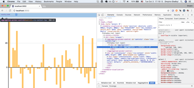
Open URL and check that our aggregation picker is still
aggregation-picker-control custom HTML:

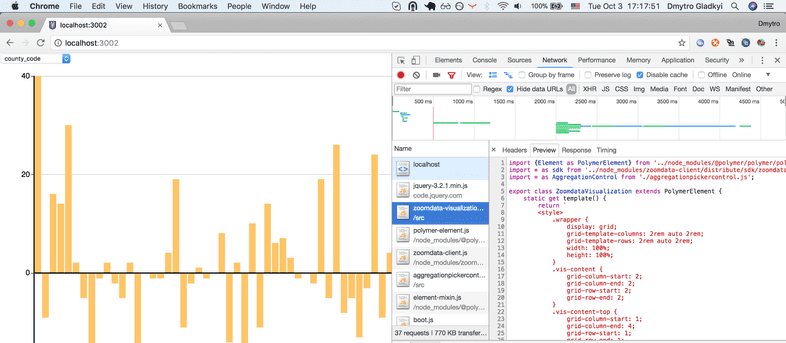
Switch to Network tab in Dev tools and check that not bundled, not compiled code
was processed by Chrome without any issues:

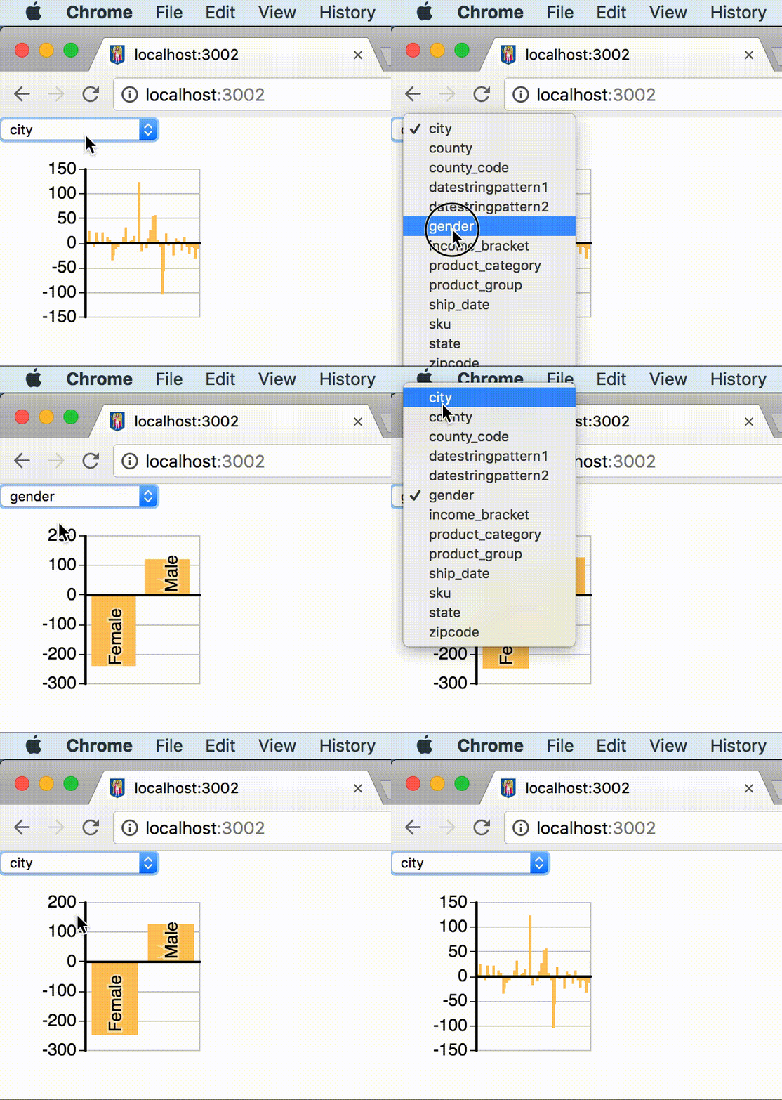
And see it in action:

Now you can reuse this component in any of your UI frameworks.